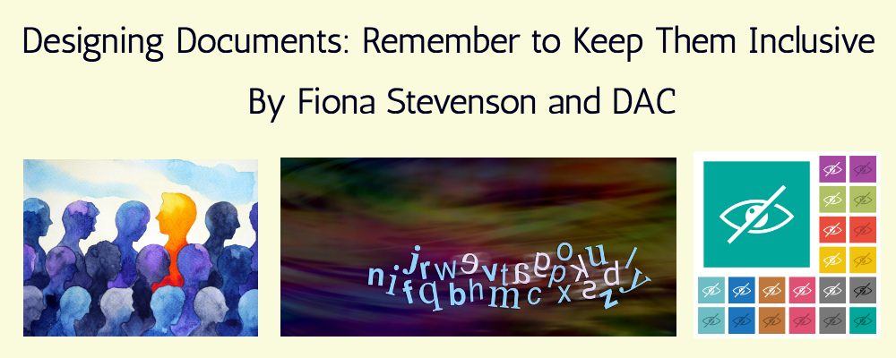
Designing Documents: 'Remember to Keep Them Inclusive' By Fiona Stevenson and DAC
Blog Background: PhysioPod were introduced to Fiona Stevenson (Scope Awards 2022 Purple Pioneer Finalist) in February 2021 by Gaynor Leech of LWO Community.. Fiona wrote on LinkedIn "Hi Mary. I have known Gaynor for a few years now. We met at a charity event at John Lewis in Birmingham. I am the founder secretary of Swimming After Surgery (SAS) which helps ladies who have cancer through swimming and other help and support that the ladies require. I do what I can to help others".
In conversation, Gaynor had mentioned to Mary how incredibly helpful Fiona had been in teaching her to understand about typefaces, fonts, colours and backgrounds to make them accessible to all. Mary asked Fiona if she could write up some of her findings for their readers. With the help of DAC, her friend, they wrote this very useful blog. For further helpful reading accessibility training, see foot of article.
When planning documents whether it be for a website or posters etc please consider the following for people with dyslexia and visual impairment.Thank you in advance for taking the time to read our joint blog, which is based upon our gathered knowledge, thoughts and feelings and for those who prefer to look and or listen, Mary Fickling of PhysioPod has kindly created this video with voice over from our words.
Backgrounds Fonts Size and Colours
If somebody has Dyslexia:
White print on a black background is bad
Black print on a white background is bad.
And these should be avoided as much as possible.
A pale green or cream background is better than white.
A brown font is better than black.
Watch out for colours too, green writing on a white background is difficult to read.
Pink writing on a white background is difficult to read.
By having a font size of 16 Comic Sans or Arial enables a person with dyslexia to read documents
Someone who is visually impaired may also be able to read a size 16 font but they may prefer Arial.
Clear print rather than italics is usually preferred.
Try not to mix colours in words, by having one letter purple, another green and the next yellow,
may make it extremely difficult for people with glaucoma to read it too.
Be Prepared
Please be prepared to offer alternative documents for someone who is visually impaired.
At a railway station the announcement boards are black, with yellow, orange wording.
To someone with dyslexia, these boards look like a picture and don't make any sense to them.
Dyslexia was often referred to as "dancing print".
So, if someone is deaf, dyslexic and visually impaired, they cannot easily gain information about their journey train journey.
Filters
Filters for dyslexia are a spectrum of colours from pastel to neon,
while someone can read on a lilac, another reads better on a neon yellow.
Again everyone is different, so what suits one person may not suit another.
A filter can be a piece of coloured acetate.
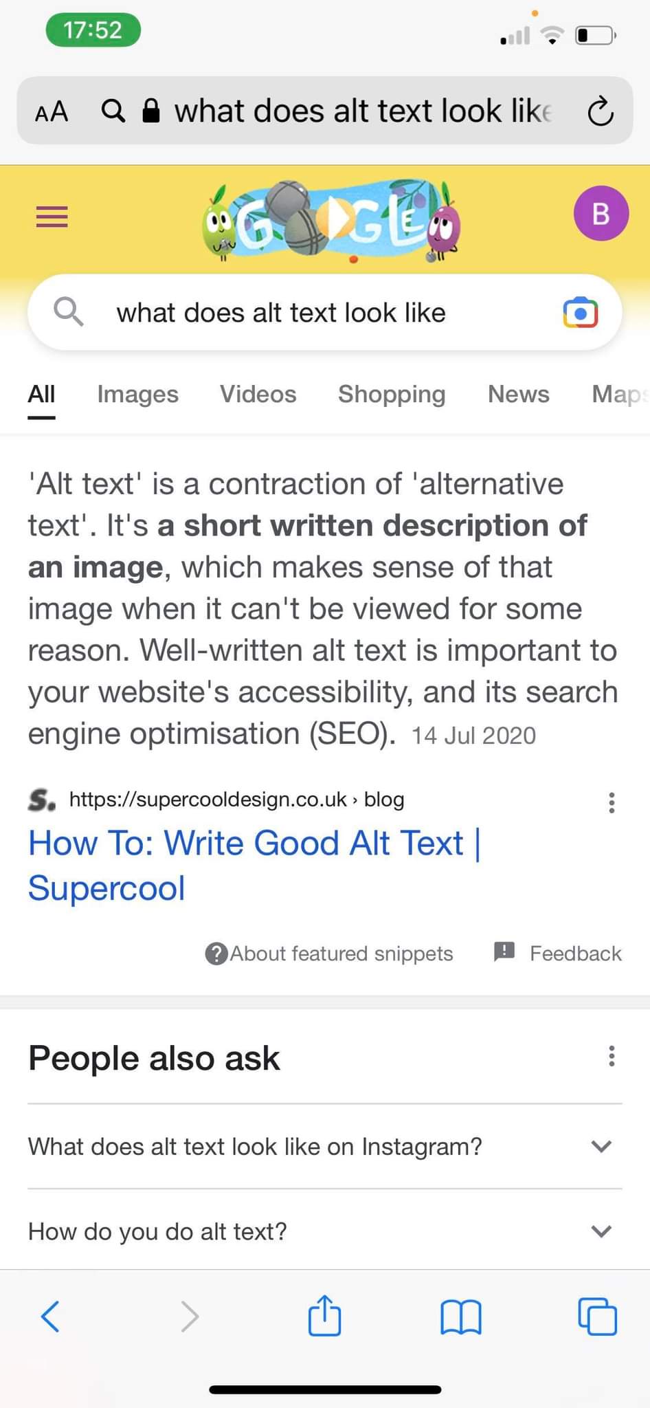
Text Readers
A text reader converts written words to audible sound so if you don't do it correctly e.g. if you screenshot a document that turns it into a PDF.
This to a text reader appears as an image and cannot be read by the text reader.
In that circumstance alt text is required to change this, so that it can be read by people with visual impairment too. Please see below
 .
. 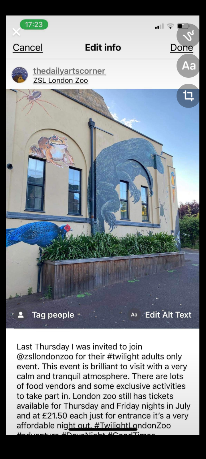
Alt text for a visually impaired person gives a verbal description of the photo.
However for a dyslexic person, Alt Text turns a photographed document into an audio file.
Whoever is setting up documents, needs to manually input Alt Text as it does not automatically do this.
https://blog.hubspot.com/marketing/image-alt-text
These issues need to be considered when planning any sort of leaflet, web page, poster or flyer when promoting services.
By offering alternative styles and finding out what each individual needs to communicate with them is useful, as we are all individual with very individual needs.
As we age, our eyes grow weaker, and we may require aids, like magnifiers or we hold a document at arm's length to read it.
If the print is a minimum font size of 16, it is suitable for most people and prevents the above scenario.
Please try and be as inclusive as possible when designing documents.
Fiona & DAC.
About Fiona Stevenson
Fiona has been nominated in the 2022 Scope Awards in the category - Purple Pioneer. This category honours an individual, or a group of people, who have been nominated by others for their achievements around disability equality. This could be either a disabled person or a non-disabled ally who has raised awareness of disability issues or changed attitudes in their community. Rather than a specific campaign, this category recognises the work people have done that has positively affected those directly around them.
Fiona campaigns widely for accessibility and inclusion in Telford and Wrekin. An active member of both the local Healthwatch and the Making It Real Board, she takes on fixed mindset bureaucracies and creates tangible change. For example, as a breast cancer survivor she formed and runs Swimming After Surgery (SAS) for other survivors. And she uses her knowledge of horizontal emergency evacuation and lift usage to educate hotels and event organisers about fire safety and access.
Fiona's Public Contact Information
Website Twitter